Case Studies & Projects

Case Studies

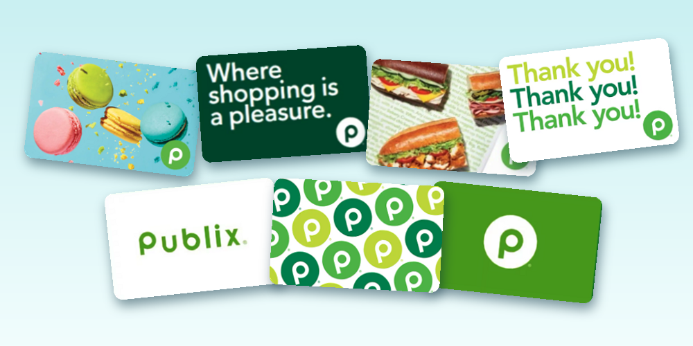
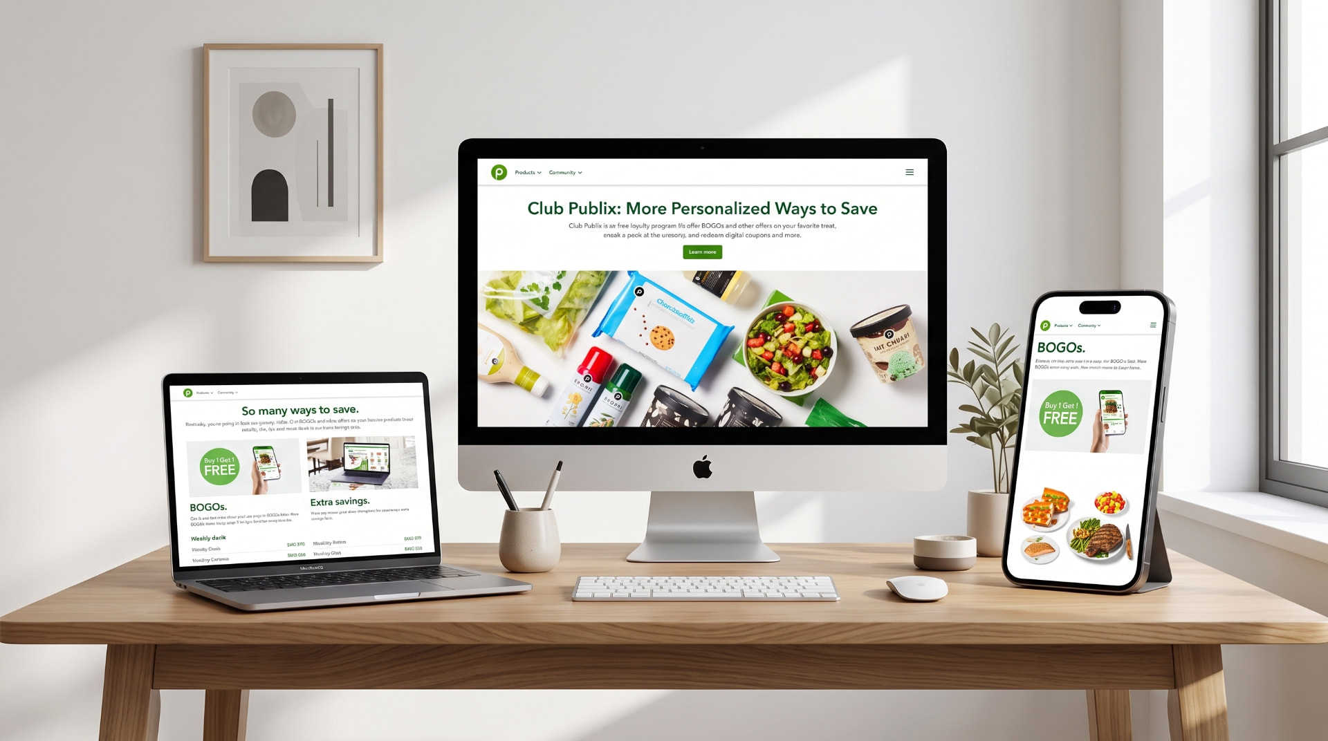
Club Publix and Publix.com experiences shown on desktop, laptop, and mobile
Publix Super Markets — $60B Fortune 500 retailer
CASE STUDY
ProgramProject
Design SystemsDigital PlatformsOmnichannelPMO Leadership

Building a Scalable Digital Design System for a Fortune 500 Retailer

Role
Sr. Project & Product Manager, PMO Leadership
Client
Publix Super Markets — $60B Fortune 500 retailer
Team
22Squared, Fueled, Salesforce, internal IT, Marketing, Creative, PMO
Tools
Headless WordPress, tokenized design system, Salesforce
  • 10 → 3 months per site build (~70% faster)
  • $6M–$8M portfolio, 18–22 concurrent projects
  • 15+ sites shipped on the new platform

The challenge

Publix was managing a broad omnichannel digital portfolio — web, mobile, social, email, print, and in-store — as a $60B Fortune 500 retailer. New site builds required heavy coordination across internal teams, external partners, and technology teams, and could take up to 10 months. That pace risked custom one-off builds, duplicated production work, inconsistent branding, and low reuse visibility for stakeholders.

My approach

  1. 1

    Shift from one-off builds to reusable delivery patterns

    I moved the program away from treating each site as a custom project and toward a repeatable system of templates, components, and platform structures.

  2. 2

    Balance brand consistency with stakeholder flexibility

    I preserved Publix brand standards while giving teams room to support different campaigns and business needs.

  3. 3

    Align internal and external delivery partners

    I coordinated Publix teams, 22Squared, Fueled, Salesforce, IT, Marketing, Creative, and PMO stakeholders across both strategy and execution.

  4. 4

    Prioritize scalability over short-term customization

    I guided the tradeoff conversations on when custom work was genuinely worth it versus when a reusable pattern would serve the portfolio better.

  5. 5

    Build a platform that improved future delivery, not just the current project

    I treated the design system as an operating foundation for future properties rather than a one-off deliverable.

1

Strategy

Business requirements and brand standards translated into system requirements.

2

Atoms

Design tokens — color, type, spacing, buttons, inputs, icons.

3

Molecules

Atoms combined into components — cards, nav, forms, media blocks.

4

Features

Molecules composed into modules — hero sections, product grids, campaign blocks.

5

Pages

Modules assembled into page templates.

6

Sites

New properties launched by configuring the system — 15+ sites shipped.

How the system scales: strategy through atoms and molecules into features, pages, and a series of new sites. Recreated for illustration — conceptual, not a literal screenshot.

Impact

  • Reduced site build timelines from 10 months to 3, cutting delivery time by roughly 70%
  • Created a scalable foundation letting teams reuse templates and platform structure instead of rebuilding from scratch — 15+ sites shipped on it
  • Improved consistency across digital experiences while reducing delivery friction across internal teams, agency partners, and business stakeholders
  • Created a repeatable delivery model supporting Publix's broader omnichannel portfolio across web, mobile, social, email, print, and in-store
"A good design system is not just a design asset — it's a delivery system."

Any visuals accompanying this case study are recreated for illustration. They represent the shape of the workflow and process changes, not the client's actual internal tools, files, or proprietary documentation.
Old Republic Title (contract), extended into Ascendum
CASE STUDY
ProductProgram
AIProcessGovernance

Building AI into the production process, not just the output

Role
Sr. Project Manager (Old Republic Title) → UI Designer & Project Manager (Ascendum)
Client
Old Republic Title (contract), extended into Ascendum
Team
Product and design teams, HR stakeholders, corporate Governance team
Tools
Claude Code, Figma, Gemini, internal AI-assisted workflow tools
  • 25% shorter project lifecycles
  • 90% chatbot success rate (UAT 78% → 90%)
  • 3 product teams onboarded

The challenge

Production processes across creative and development workflows were manual and sequential by default — every project moved through the same steps at the same pace, regardless of whether AI tooling could shorten any of them. With three concurrent product teams and a growing project load, the org needed faster turnaround without adding headcount, and no one had yet mapped where AI could actually remove work rather than just assist with it.

My approach

  1. 1

    Process audit

    I looked at the existing production workflow stage by stage to find where steps were manual, repetitive, and a genuine fit for AI assistance, rather than applying AI broadly and hoping something stuck.

  2. 2

    Tooling and proof of concept

    I designed and implemented streamlined, AI-assisted production processes across the three product teams I directed, each with a five-person development team, and built a proof-of-concept chatbot for internal HR needs as a contained way to test the approach before scaling it further.

  3. 3

    Governance and scale

    I partnered with the corporate Governance team to vet the new process strategies and get them formally adopted rather than left as an informal workaround, which is what made the approach durable enough to carry into my current role leading AI-driven design system development for enterprise clients.

Impact

  • Reduced overall project lifecycles by 25%
  • HR chatbot POC achieved a 90% success rate, with UAT performance rising from 78% in round 1 to 90% in round 2, leading to corporate-wide approval for implementation
  • The process-first approach to AI adoption carried directly into current work building AI-driven design systems and internal tooling

Any visuals accompanying this case study are recreated for illustration. They represent the shape of the workflow and process changes, not the client's actual internal tools, files, or proprietary documentation.
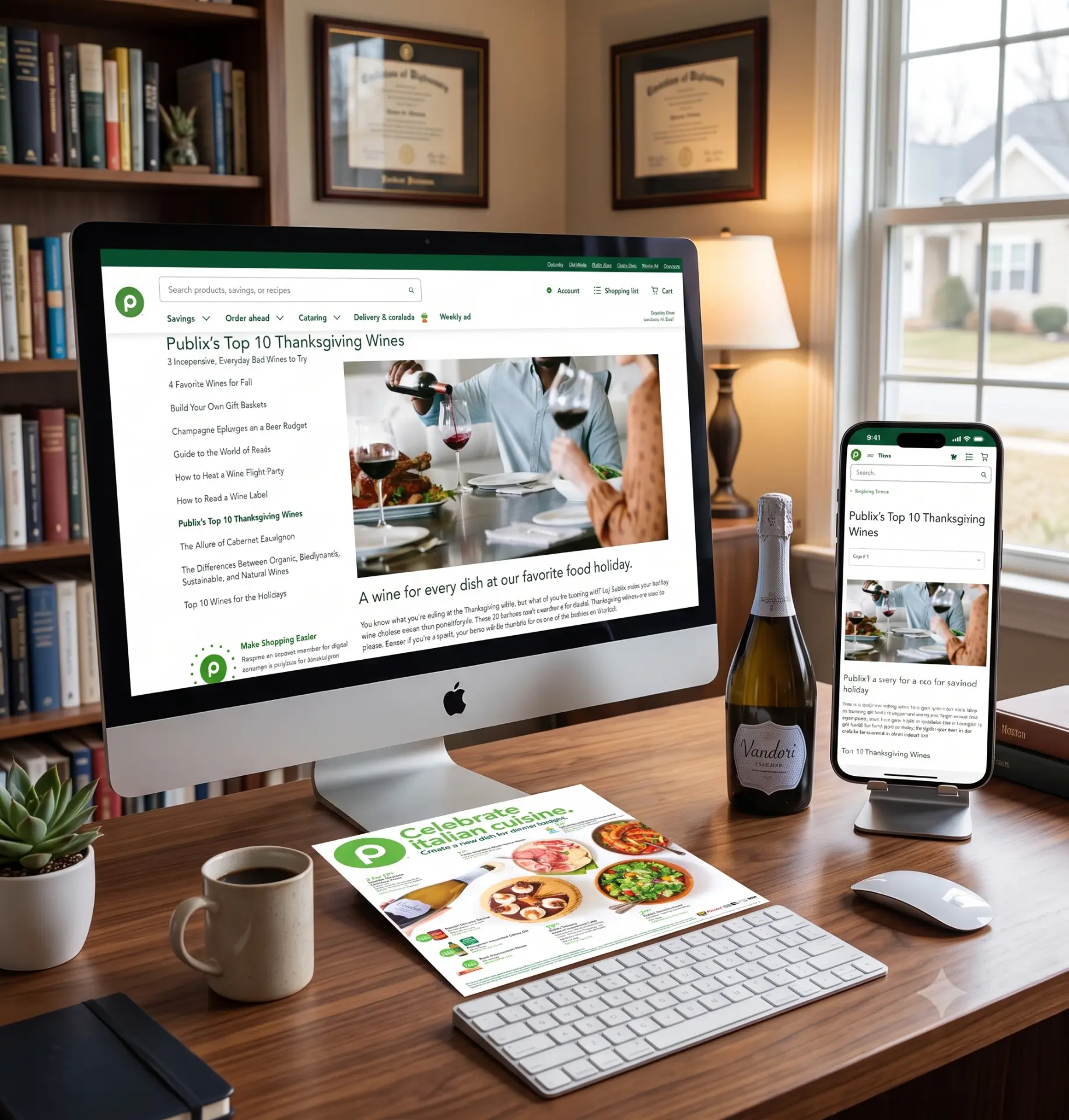
Publix Wine Club experience shown on desktop and mobile alongside printed materials
Publix Super Markets
CASE STUDY
ProductProgram
LoyaltyGrowthOmnichannel

Turning a print loyalty club into a digital growth engine

Role
Sr. Project & Product Manager, PMO Leadership
Client
Publix Super Markets
Team
Brand, Creative, Information Systems, photography team + agency partner (22Squared)
Tools
Adobe Analytics, Google Analytics, CMS/AEM, email/CRM platform
  • 300,000 members
  • +30% sign-ups
  • ~8 years of print content moved online

The challenge

Publix's Wine Club began as a print and email program. Members signed up to receive emails, direct mail, and magazines about wines, pairings, recipes, and wine education. Sign-ups came in two ways: paper cards filled out in stores and sent to corporate for manual processing, or email. The program had no dedicated digital home.

My approach

  1. 1

    Discovery first

    I mapped how members actually joined and found the split between in-store paper cards, processed by hand at corporate, and email sign-up. Retiring the paper option and moving sign-up fully online removed the manual step.

  2. 2

    Build the digital home

    I directed the conversion to a dedicated Wine Club website with Brand, Creative, Information Systems, and 22Squared, moving roughly 8 years of print content online: wine regions, pairings, and infographics.

  3. 3

    Keep the omnichannel engine running

    I ran the monthly email (a red and a white wine, each with a pairing, a recipe, and a seasonal theme) and quarterly direct mail, including a 6-page holiday booklet. I hired the photography team, secured locations and product, and led the photoshoots.

Impact

  • Grew membership to 300,000 and increased sign-ups 30%
  • The site and emails drove sign-ups around a buy-X-get-a-free-bottle offer
  • Moved sign-up from manual paper processing to fully online
  • Recognized with Gold and Silver Addy awards as part of the broader Publix digital platform work

Any visuals accompanying this case study are recreated for illustration. They represent the shape of the workflow and process changes, not the client's actual internal tools, files, or proprietary documentation.
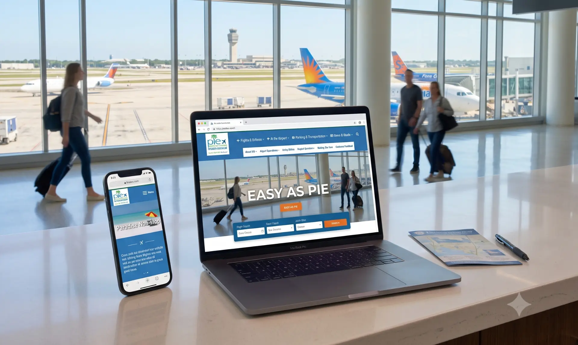
Fly2Pie responsive website shown on laptop and phone in the airport terminal
St. Petersburg/Clearwater International Airport (Fly2Pie)
CASE STUDY
Project
DigitalUXUICMS

Turning a decade-old airport site into a real-time passenger tool

Role
Project Manager - Digital
Client
St. Petersburg/Clearwater International Airport (Fly2Pie)
Team
Brand, Creative, Development/Engineering
Tools
AWS, Sitecore, Adobe Analytics, Google Analytics, CMS/AEM, email/CRM platform
  • +30% email list in 90 days
  • 3rd place ACI-NA Excellence Awards
  • Arrivals & Departures on web and terminal monitors

The challenge

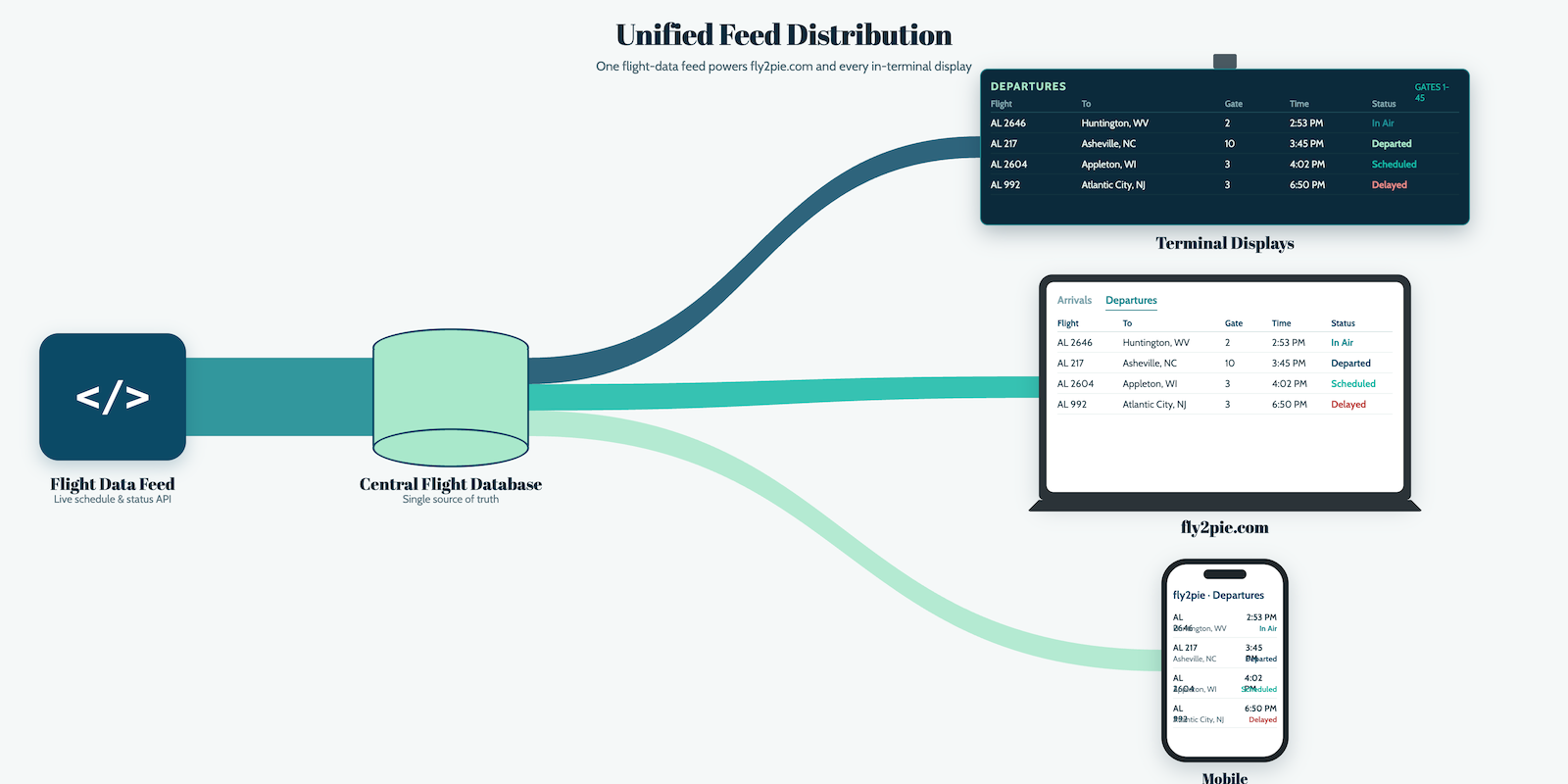
St. Petersburg/Clearwater International Airport's website was 10 years old and needed a full overhaul to work on current technology and platforms. The airport wanted a responsive site with a new front and back end they could manage themselves, a CMS that could support ongoing updates, and an email program that could generate emails from a template, collect subscribers, and manage the distribution list. The most technically demanding piece was rebuilding the Arrivals & Departures system so it could feed both the website and the airport's physical terminal monitors.

My approach

  1. 1

    Project strategy and plan

    I ran project strategy sessions to align the client's needs with site capabilities, then recommended platforms, costs, and resourcing for approval before design and development started. I defined scope, schedule, milestones, and the UAT plan needed for a successful launch, and secured client and business-team sign-off on cost estimates along the way.

  2. 2

    Communication cadence

    I led daily and weekly redesign meetings with the creative and development teams, tracking progress through stand-ups and aligning on weekly milestones. I held weekly status calls with the client and ran live reviews at their office to walk through concepts and functional demos for approval.

  3. 3

    Redesign and integration

    I led the creative and development teams in building a responsive UI that surfaced key airport and terminal information, including the Arrivals & Departures functionality passengers needed for their trips.

  4. 4

    Documentation and training

    I authored the Business Requirements Document and the training manuals for ongoing maintenance and email creation/deployment, personally ran three hands-on sessions to get client administrators self-sufficient on the CMS and email tools, and stayed on as troubleshooting backup from the FKQ office.

Diagram of one flight-data feed powering fly2pie.com, mobile, and in-terminal departure displays
Arrivals & Departures data flow — one feed powering fly2pie.com and every in-terminal display.
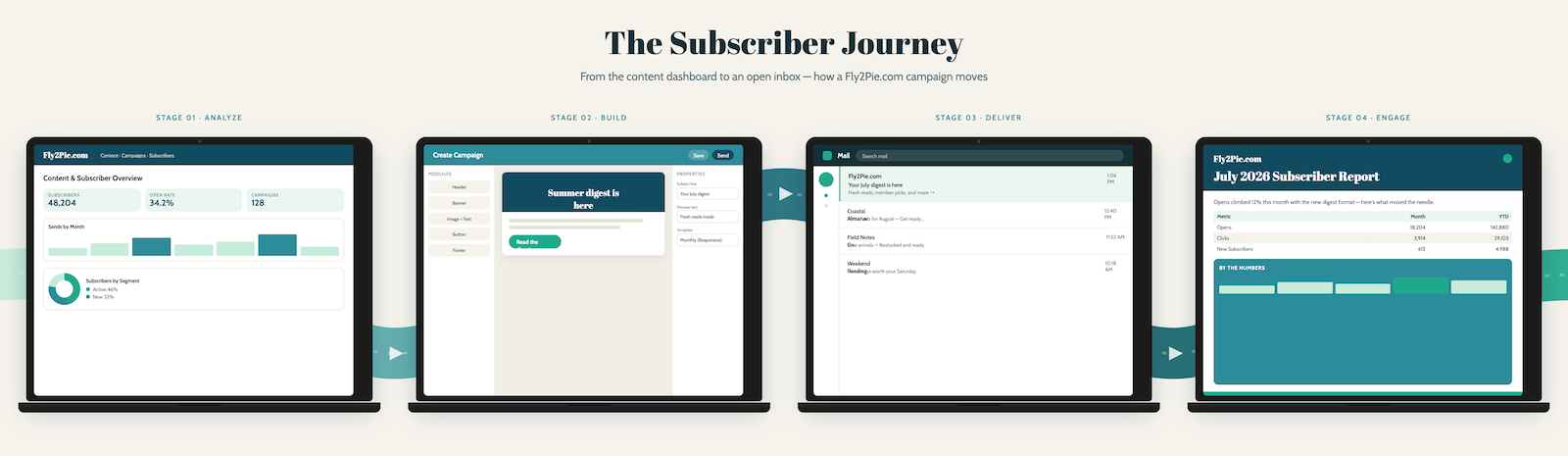
Four-stage subscriber journey from content dashboard to campaign build, delivery, and reporting
CMS + email builder — the subscriber journey from campaign build through delivery and reporting.

Impact

  • Delivered a fully responsive site rebuilt on current platforms, tools, and code standards
  • Built a new email creation and deployment platform inside the CMS, growing the distribution list 30% in the first 90 days
  • Rebuilt the Arrivals & Departures system to feed both the website and the airport's terminal monitors
  • Recognized with 3rd place in the ACI-NA Excellence Awards for Fly2Pie.com
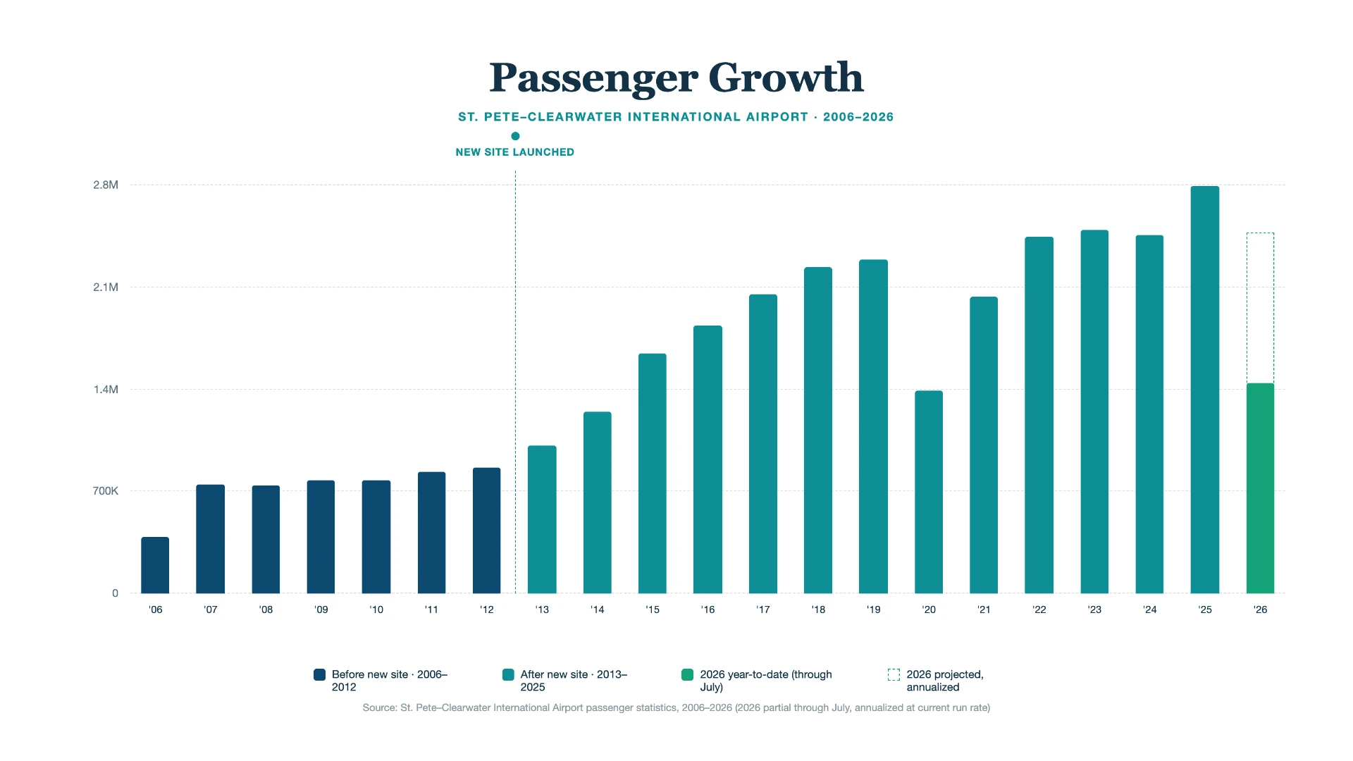
  • Airport-wide passenger traffic grew from 800,000+ in 2012 to 1.1 million in 2013, averaging 25% YoY growth from 2012–2022 (excluding 2020) — broader business context the redesigned digital platform was built to support
Passenger growth at St. Pete–Clearwater International Airport from 2006 to 2026, with the new site launch marked in 2013
Passenger growth (2006–2026) — the new site launched in 2013, framed as business context rather than attributed lift.

Any visuals accompanying this case study are recreated for illustration. They represent the shape of the workflow and process changes, not the client's actual internal tools, files, or proprietary documentation.
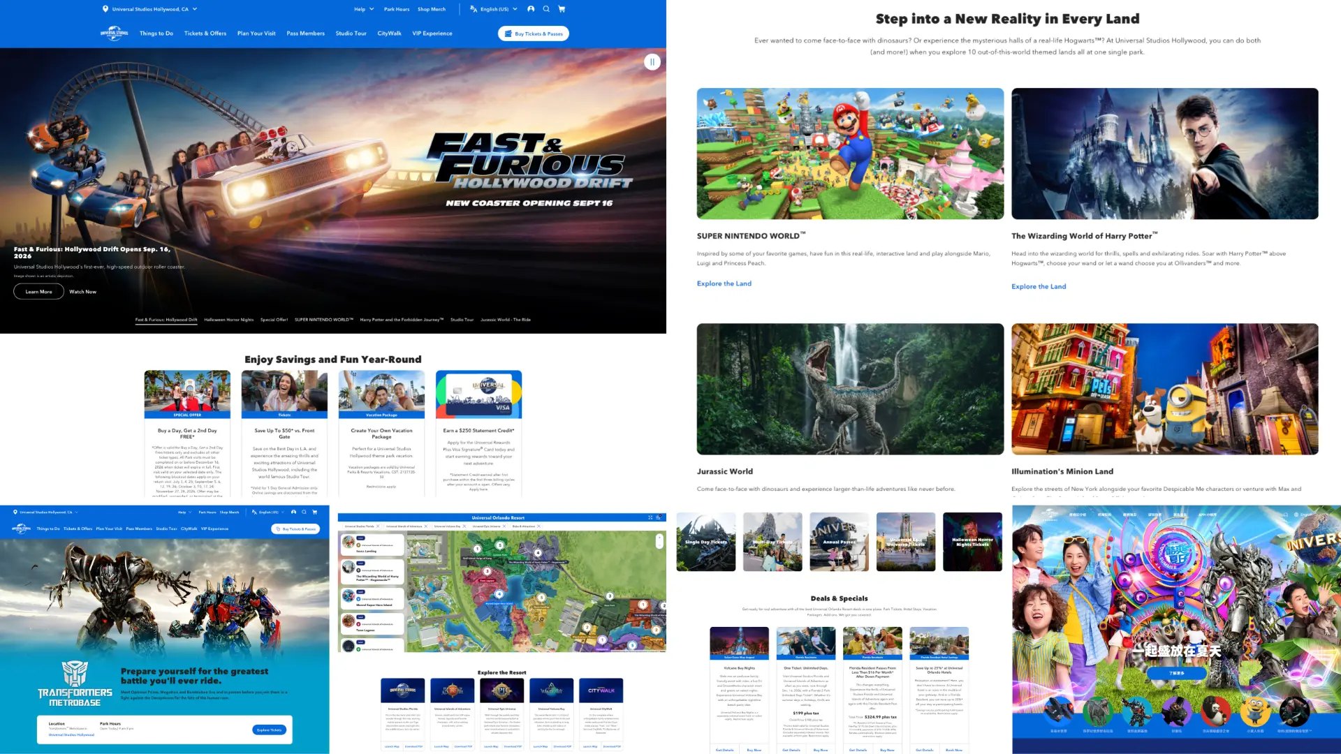
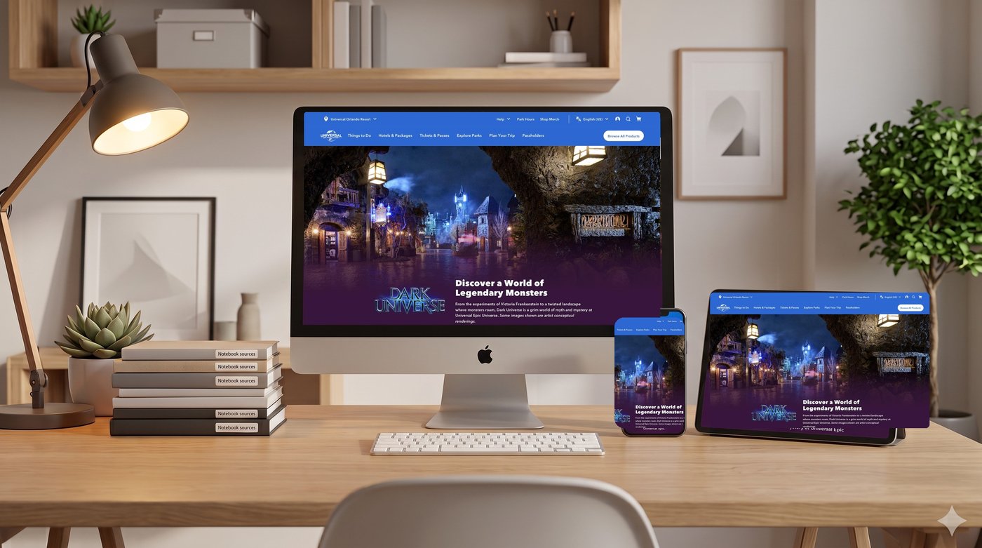
Universal theme park websites and mobile experiences built on the Global Design System
Universal Destinations & Experiences
CASE STUDY
ProductProgramProject
Design SystemProductMobile

Getting Universal: unifying theme parks onto one Global Design System

Role
Project & Product Manager
Client
Universal Destinations & Experiences
Team
30-person team (15 UX/UI designers plus copywriters, BAs, developers, and a Scrum Master); 50+ stakeholders including vendors, Legal/IP, and business owners
Tools
Design system/component tooling, JIRA, Flutter (mobile)
  • 1,000+ pages converted
  • Up to 40% shorter design lifecycle, $500K+ returned
  • 106M+ annual guests supported
  • +17% conversion, +30% app NPS

The challenge

Universal's digital properties had grown up independently across Universal Studios Hollywood, Universal Studios Orlando, Universal Japan, and the newly opening Epic Universe park. Each had its own versions of maps, calendars, and page templates, which meant every enhancement — a new ticketing flow, a new wayfinding feature — had to be re-solved separately for each park, per platform. The long-term digital strategy called for something more ambitious: a single system that connects park sites, hotels, reservations, mobile food ordering, and geo-targeted wayfinding across all four markets, rather than four parallel one-off builds.

My approach

  1. 1

    Foundation: an atomic component system

    Rather than a one-time redesign, I directed the build of the Global Design System (GDS) on an atomic component methodology — base components that assemble into reusable page templates, so new pages could be built from an existing library instead of custom-coded every time. This foundation made it possible to convert 1,000+ pages across all four markets to a single system.

  2. 2

    Interconnected sub-systems

    With the component system in place, I owned the roadmap for three initiatives that plugged directly into it: wayfinding maps redesigned to highlight each park's new themed "Land" zones plus an entirely new map built from scratch for Epic Universe; five new calendar types (ticketing, hotel, food ordering, reservations, and event planning) so each transactional flow had a purpose-built calendar instead of one generic type stretched to fit; and the mobile app's move to Flutter, improving content deployment performance and giving users a faster, more efficient app.

  3. 3

    Cross-regional delivery

    I ran the day-to-day timeline and priority plan for the GDS conversion with the Japan team, sequencing work so US teams built and handed off to Japan, where I worked hands-on on design and implementation; for China, we handed off assets and code and made sure their team implemented them. Releases were timed to in-market moments, and cultural-adaptation guidelines ran through Legal/IP review.

Impact

  • Converted 1,000+ pages across Hollywood, Orlando, Japan, and Epic Universe onto the unified GDS
  • Standardized page templates delivered up to a 40% reduction in budget and resource hours on subsequent projects — typical project timelines dropped from roughly 4 months to 2–2.5 months, since new work assembled from the existing component library instead of being built from zero
  • Supports a platform serving 106M+ annual guests across Hollywood, Orlando, Japan, and Epic Universe
  • Contributed to a 17% increase in B2C/B2B2C conversion and a 30% boost in mobile app NPS
  • Established the map, calendar, and mobile foundations needed to support Universal's longer-term plan of connecting park, hotel, reservation, and food-ordering experiences into one system

Any visuals accompanying this case study are recreated for illustration. They represent the shape of the component system and program structure, not Universal's actual design files, code, or internal documentation.